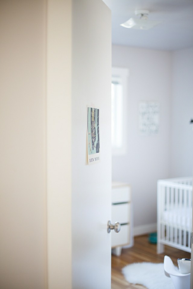
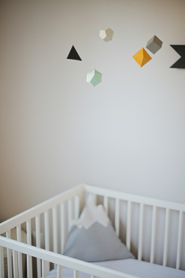
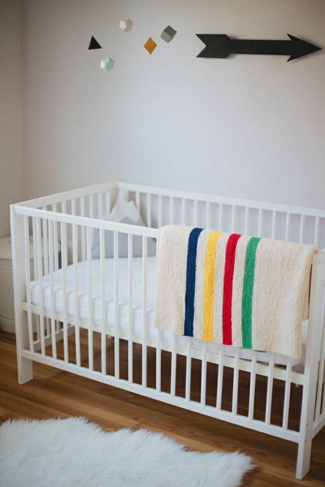

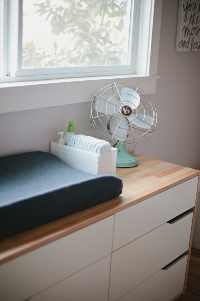
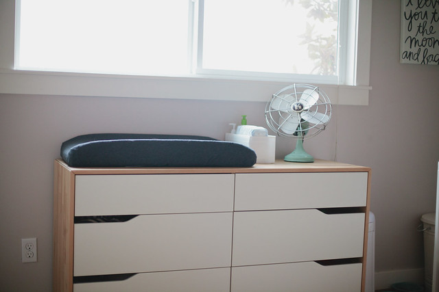
We opted out of the themed nursery which probably makes us the most unhip parents on internet right? This room is pretty tiny so I wanted to keep it simple and minimal. We picked a dresser that could double as a changing table but also be a piece we could use for years, I'm super happy with this one. Since we bought almost everything used (and made the other things) we spent next to nothing for his sweet little room (which is good because I would've spent way too much on it)
It's bright and airy and my favorite spot in the house.
Crib and Dresser: Ikea
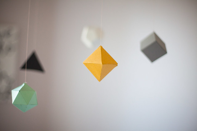
Geometric Mobile: DIY (tutorial coming soon!)
Black Arrow: DIY
Fan: Vintage
"I love you to the moon and back" Canvas: Red Envelope
Knit Blanket: Handmade
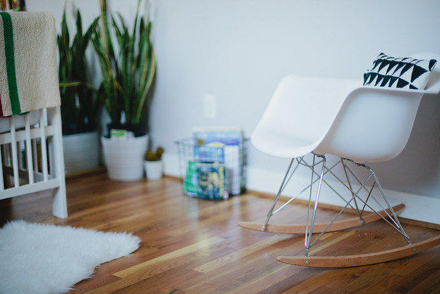
Rocking Chair: Baxton Studios
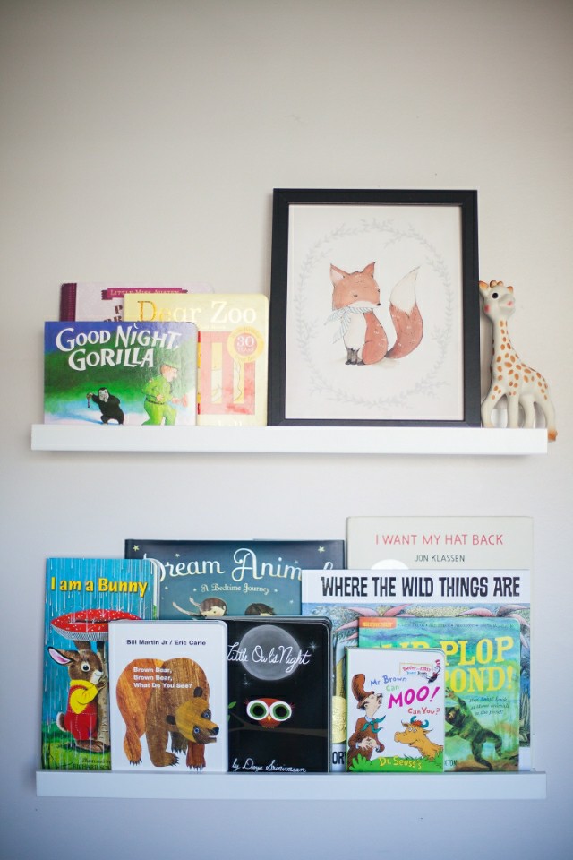
Fox Print: Kelli Murray
Gray Changing Pad Cover: DIY

beautiful place!
ReplyDeleteI love how it came together - you did an amazing job! Exactly what I would want!! xoxo
ReplyDeleteThis is so beautiful! I love the minimalist feeling of the space. And I like that you didn't go with a theme - I think room's have more longevity when they're neutral. Great job!
ReplyDeleteLove it Abi! Non-themed rooms are more interesting than themed ones in my book! :)
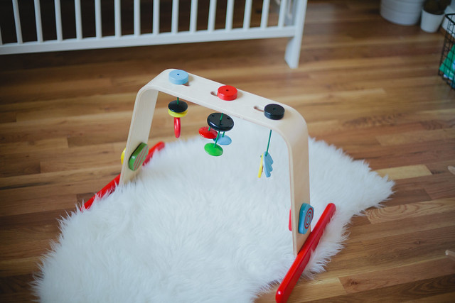
ReplyDeleteWhere did you get the wooden activity gym thing on the floor?
ReplyDeleteOops—it's from ikea too!
DeleteLOVE THE NURSERY!!!!!! I DID THE SAME FOR MY SON'S ROOM. LESS IS MORE , ALSO DID YOU MAKE TRIANGLE AND MOUNTAIN PILLOWS
ReplyDeleteSuch a sweet little nursery. I love the simplicity of it. And nice work on all the DIYs!
ReplyDeleteThat mobile is too cute -- glad to see a DIY is in the works!
ReplyDeleteLess is more - it's perfect and it's a place that looks peaceful and relaxing too
ReplyDeleteActually pretty hip :) My daughter used Ikea furniture, too without a theme. Very light and airy.
ReplyDeleteI Want My Hat Back is the funniest kids book around! My little man looses his breath when I read id with voices and at the right pace. Such a great read. Beautiful space, too. xx
ReplyDeletePretty sure lack of a theme makes you COOLER parents! :) Love the minimalist look!
ReplyDeletei love love looove this. i'm also not in to themed nurseries! the little one's grow out of it so quickly, i feel like. this room is perfect and i love the minimalist to it!
ReplyDeleteIt's perfect, exactly how I hope to decorate my future babies nurseries!! Such a great example of good minimalism, yet practical, decorating!
ReplyDeleteThis is truly lovely, Abi!
ReplyDeleteI've never done themed rooms either - much more versatile this way.
Ronnie xo